Product
Why more “friction” isn’t always a bad thing
WRITTEN BY

PUblished ON

We recently added additional messaging to the candidate journey to help candidates better understand what data Konfir is collecting, and what it is used for. From a user experience (UX) perspective, we had the choice of adding content to existing pages in the journey or introducing a new page altogether. We landed on the latter.
The impact of extra steps in a user journey is a topic that has been widely discussed in the world of Product Design. While it's easy to believe that more pages or clicks equal higher abandonment rates, this is not always the case. Adding additional steps to a process may sometimes improve the overall user experience and increase conversion when done for the right reasons.
You’ll find countless articles parading how reducing friction will lead to better conversion rates. Oftentimes, however, they fall short of defining what ‘friction’ actually is and instead use the word synonymously with metrics like the number of steps, questions, or clicks. While friction can include these three things, a more common source of friction comes from users either not knowing what they’re doing, or why they’re doing it.
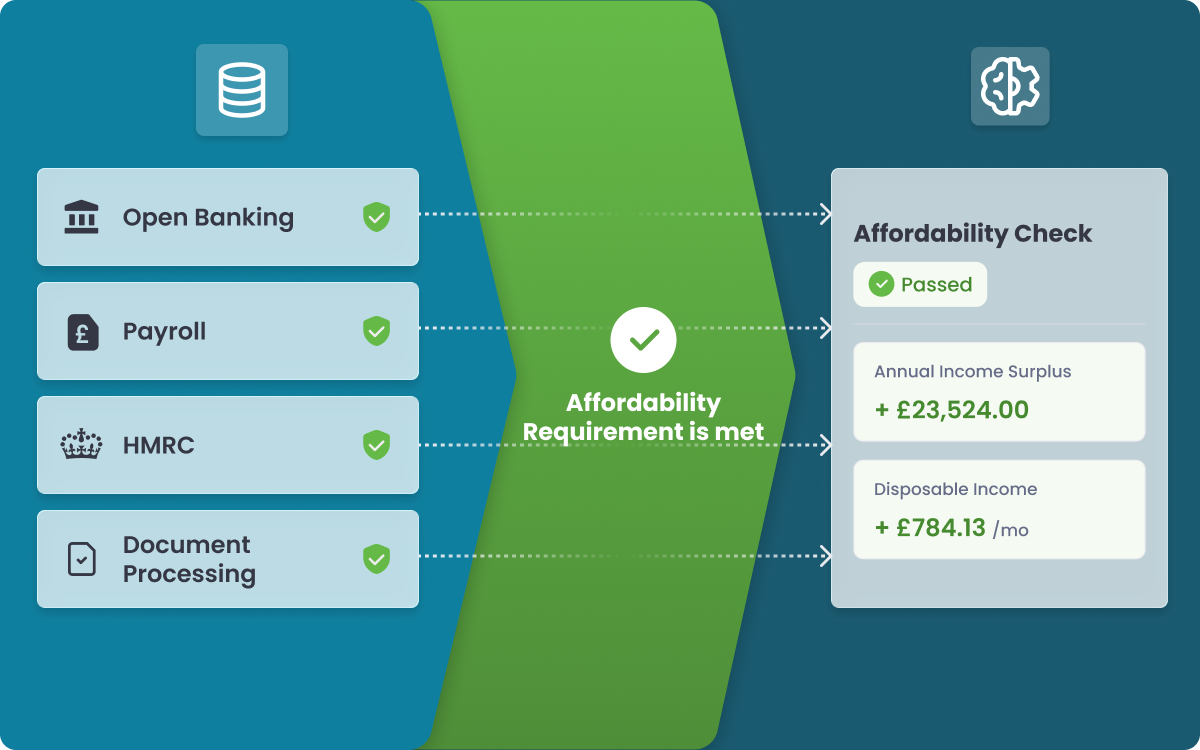
In November, we set out to explore a question on a similar principle: “why are some candidates not completing the journey?”. We interviewed 10 candidates that didn’t complete and reviewed the anonymised data. Among other useful insights, one theme began to emerge - candidate comfort. It made sense, after all, we’re asking them to provide access to some very sensitive information. While we already provided links to FAQ pages and information on security at Konfir - we recognised that we could give candidates more timely and digestible information.
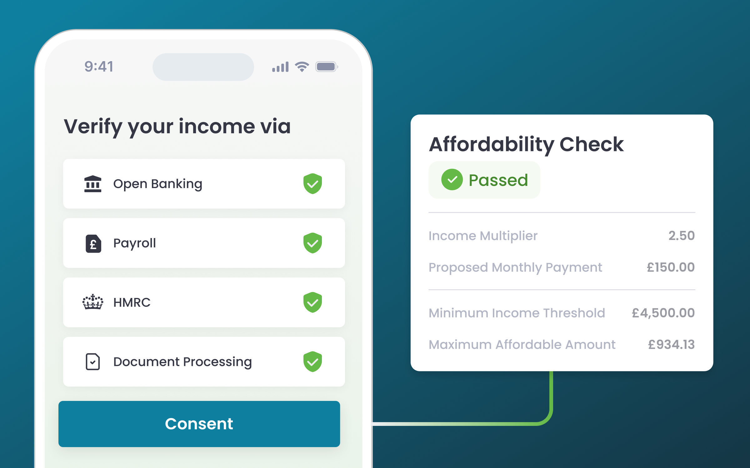
As we recognised the importance of making sure candidates understand how we use their data, we added a separate screen to our journey that focuses solely on data usage. This screen was designed with the goal of both informing users and building trust, while also minimising the amount of information they need to process at once.
In our design process, we followed some key principles:
Furthermore, our research showed that users were willing to spend more time on the initial onboarding screens, as they recognised that it was a process they wouldn't have to go through frequently. We designed this screen to be simple, catering to both detail-oriented users and those who quickly scan titles and move on.
We introduced this new screen, which is now the second page candidates will see when using Konfir
By giving candidates a clear understanding of what data is being collected and used for, they have reported to “feel more in control of the process”, and we have seen conversion rates increase as a result. In a statistically significant comparison (looking at 1 month of candidates), our conversion rate jumped from 76% to 80%.
While at first glance it may seem counterintuitive, adding an additional step to a user journey can often improve the overall experience and increase conversions. Konfir's new screen is a perfect example of this. When it comes to designing user journeys, it's important to keep an open mind and remember that more clicks aren't always a bad thing.
.png)